How to match colors in fashion: pro styling tips
TL;DR:
- Color coordination in streetwear relies on simple principles like the color wheel and matching schemes. Knowing your undertone and using the 60-30-10 rule enhances outfit harmony. Breaking traditional rules with bold, unexpected color combinations is trending and encourages personal expression.
You pull out two pieces you love separately, put them together, and something just feels off. The colors clash, the vibe is wrong, and you can’t figure out why. Color coordination is one of those skills that looks effortless on the people who have it and completely invisible when done right. The good news? It’s not magic. It’s a mix of simple color theory, knowing your own undertone, and a few rules worth bending. Whether you’re building a streetwear fit from scratch or trying to level up what’s already in your closet, this guide breaks it all down in a way you can actually use.
Table of Contents
- Understanding color theory basics for style
- How to choose your dominant color and undertone
- Applying color matching frameworks: Rules for balanced streetwear
- Avoiding color clashes and common mistakes
- Why fashion color rules are meant to be broken in 2026
- Upgrade your color game with our trend-ready essentials
- Frequently asked questions
Key Takeaways
| Point | Details |
|---|---|
| Master the color wheel | Using color wheel basics helps you consistently pair colors that work well together and match your personal style. |
| Pick one bold color | For streetwear, a single statement color with neutrals ensures your outfit stands out without clashing. |
| Use simple color rules | Applying the 80/20 or 60-30-10 rule simplifies matching and makes any ensemble instantly more stylish. |
| Minimize color clashes | Limiting yourself to two to four colors and anchoring your look with neutrals prevents overload and mismatched vibes. |
| Experiment with trends | Trying unexpected color combos and accessories elevates your fashion confidence and keeps your look fresh for 2026. |
Understanding color theory basics for style
Before you can break the rules, you need to know them. Color theory is the foundation behind every great outfit, even if the person wearing it has never heard the term. It starts with the color wheel, which organizes colors into three groups: primary (red, yellow, blue), secondary (orange, green, violet), and tertiary (the in-betweens like red-orange or blue-green).
From there, everything in fashion color matching flows from four core schemes. Complementary color matching uses opposites on the wheel, like blue and orange, for maximum contrast and visual punch. Analogous colors sit next to each other, like blue and green, giving you a harmonious, easy-to-wear look. Monochromatic means working within one color using different shades and tones. Triadic pulls three evenly spaced colors together for a bold, balanced result. These color wheel matching methods are the core methodologies pros use in fashion.

| Scheme | Matching approach | Visual impact | Streetwear use |
|---|---|---|---|
| Complementary | Opposites (blue/orange) | High contrast, bold | Statement fits, sneaker pops |
| Analogous | Neighbors (blue/green) | Calm, cohesive | Tonal layering, monochromatic sets |
| Monochromatic | One color, varied shades | Clean, elevated | All-black, all-gray looks |
| Triadic | Three spaced colors | Dynamic, energetic | Color-block streetwear |
Color psychology also plays a real role in how your fit reads to others. Warm colors like red, orange, and yellow feel energizing and dominant. Cool colors like blue, green, and purple feel calm and collected. This matters when you’re building a look with intention. Want to project confidence? Go warm. Want to look effortlessly cool? Lean into blues and greens.
Keep an eye on streetwear color trends to see how these schemes play out in real fits right now.
Pro Tip: Go through your five favorite pieces and write down their colors. If you notice a pattern (lots of navy, earthy tones, or neutrals), that’s your natural color language. Build from there.
How to choose your dominant color and undertone
Here’s where most people skip a step that changes everything. Your skin’s undertone, whether cool, warm, or neutral, affects which colors will make you look alive versus washed out. Cool undertones (pink or bluish hues in the skin) tend to look sharp in jewel tones, icy blues, and true whites. Warm undertones (golden or yellow hues) glow in earthy tones, warm reds, and creamy whites. Neutral undertones can pull from both sides.
Once you know your undertone, picking a dominant color for any outfit becomes a lot more intentional. The 60-30-10 rule is a practical framework: 60% dominant color, 30% secondary color, 10% accent. For a simpler approach, the 80/20 rule works great in streetwear, 80% neutral base, 20% bold statement.
Here’s how to build a color-matched outfit step by step:
- Identify your undertone. Check the veins on your wrist. Blue or purple veins lean cool. Green veins lean warm. A mix means neutral.
- Choose a mood. Are you going for bold and loud or clean and minimal? This sets the energy of the whole look.
- Pick your dominant color. This is the color that takes up the most visual space. Match it to your undertone for the most flattering result.
- Add a supporting color. Use your color scheme (complementary, analogous, or triadic) to pick a second color that works with the dominant.
- Anchor with neutrals. Black, white, gray, beige, and navy are your safety net. They ground the look and let bold colors breathe.
Knowing how to match colors to your undertone is one of the most underrated style moves you can make. It’s the difference between wearing a color and owning it.
For more on building looks that reflect who you are, check out expressive streetwear color styling and see how bold choices come together.
Pro Tip: Grab your top three wardrobe staples and try building an outfit around each one using the 60-30-10 rule. You’ll quickly see which combinations feel natural and which need work.
Applying color matching frameworks: Rules for balanced streetwear
Now that you have the theory, here’s how it actually plays out in streetwear. The key is understanding that streetwear doesn’t just follow classic rules. It borrows from them and then pushes further.
Classic rules favor harmony. Trend-driven streetwear in 2026 favors tension. Think pink with khaki, navy with yellow, or rust with cobalt. These 2026 color combinations feel unexpected but intentional, which is exactly the point.
| Approach | Color logic | 2026 example | Vibe |
|---|---|---|---|
| Complementary | Opposites attract | Orange hoodie, blue cargos | High-energy, bold |
| Analogous | Neighbors blend | Olive tee, tan shorts, brown shoes | Earthy, cohesive |
| Monochromatic | Tonal depth | All-gray set with varied textures | Clean, elevated |
| Trend clash | Unexpected contrast | Pink crewneck, khaki pants | Playful, runway-ready |
Here are the key dos and don’ts for color pairing in streetwear:
- Do let one color lead. Pick a hero piece and build around it.
- Do use texture to add depth when colors are similar (matte vs. glossy, fleece vs. denim).
- Do use accessory color matching to tie your palette together without adding more clothing.
- Don’t mix more than three to four colors in one fit unless you’re intentionally color-blocking.
- Don’t ignore the role of your shoes. They count as a color in your palette.
- Don’t let all your colors compete at the same saturation level. Vary the brightness.
The dominant color plus neutrals approach is still the most reliable formula. Bold on top, neutral on the bottom, or vice versa. Simple, clean, effective.
For a deeper look at where streetwear color is heading, explore bold 2026 fashion trends and see what’s moving right now.
Avoiding color clashes and common mistakes
Even with the frameworks in hand, color mistakes happen. The most common ones aren’t random. They follow predictable patterns, which means they’re fixable.
The biggest offenders:
- Too many colors at once. More than four colors in a single fit creates visual noise. Your eye doesn’t know where to land.
- Mismatched undertones. Pairing a cool-toned red with a warm-toned orange, for example, creates a subtle discord that’s hard to name but easy to feel.
- Clashing saturation levels. Putting two highly saturated, bright colors together without a neutral buffer overwhelms the eye. Color coordination struggles from mismatched saturation are among the most common issues people face.
- Ignoring the full outfit. Matching your shirt and pants but forgetting your shoes or bag can unravel the whole palette.
“85% of people struggle with color coordination at some point. You’re not behind. You just haven’t had the right framework yet.”
Here’s how to fix and prevent these issues:
- Mute one color when two bold tones compete. Drop to a softer shade of one.
- Use a neutral (black, white, gray, navy, beige) as a buffer between strong colors.
- Vary texture instead of adding more color. A matte olive jacket over a glossy black tee adds depth without adding a new hue.
- Stick to two to four colors per outfit and let one dominate.
For streetwear specifically, bold contrasts work best when one color anchors the look. Let the statement color pop, then let everything else support it. If you’re experimenting with mixing patterns, the same rule applies: one focal point, everything else in service of it.

Why fashion color rules are meant to be broken in 2026
Here’s the take most style guides won’t give you: the people who dress the best aren’t always following the rules. They’re following their instincts, which were trained by experimenting with combinations that looked “wrong” on paper.
In 2026, runways are prioritizing playfulness over safety. Unexpected color clashes like pink with khaki or purple with red are showing up everywhere, not as mistakes, but as intentional statements. The traditional idea of “harmonious” color matching is giving way to tension-based dressing, where the contrast itself is the point.
This doesn’t mean throw the color wheel out. It means use it as a starting point, not a ceiling. The real confidence boost comes from trying a combination that breaks the rules and seeing that it works. Start small. Add one unexpected accent piece, a bag, a hat, a pair of shoes in a color that shouldn’t work. You’ll be surprised.
Learn to stand out with bold color and you’ll stop dressing to avoid mistakes and start dressing to make a statement. That shift is everything. And if you want to see how wearing unexpected combos actually plays out in real life, the results speak for themselves.
Pro Tip: Start with one small rule-breaking piece per outfit. A bag in a clashing color, a hat that shouldn’t match. Build your confidence in small doses before going full contrast.
Upgrade your color game with our trend-ready essentials
You’ve got the knowledge. Now you need the pieces to put it into practice. At Eledoasis, we build streetwear that’s designed to anchor bold color choices and carry statement combinations without looking overdone.
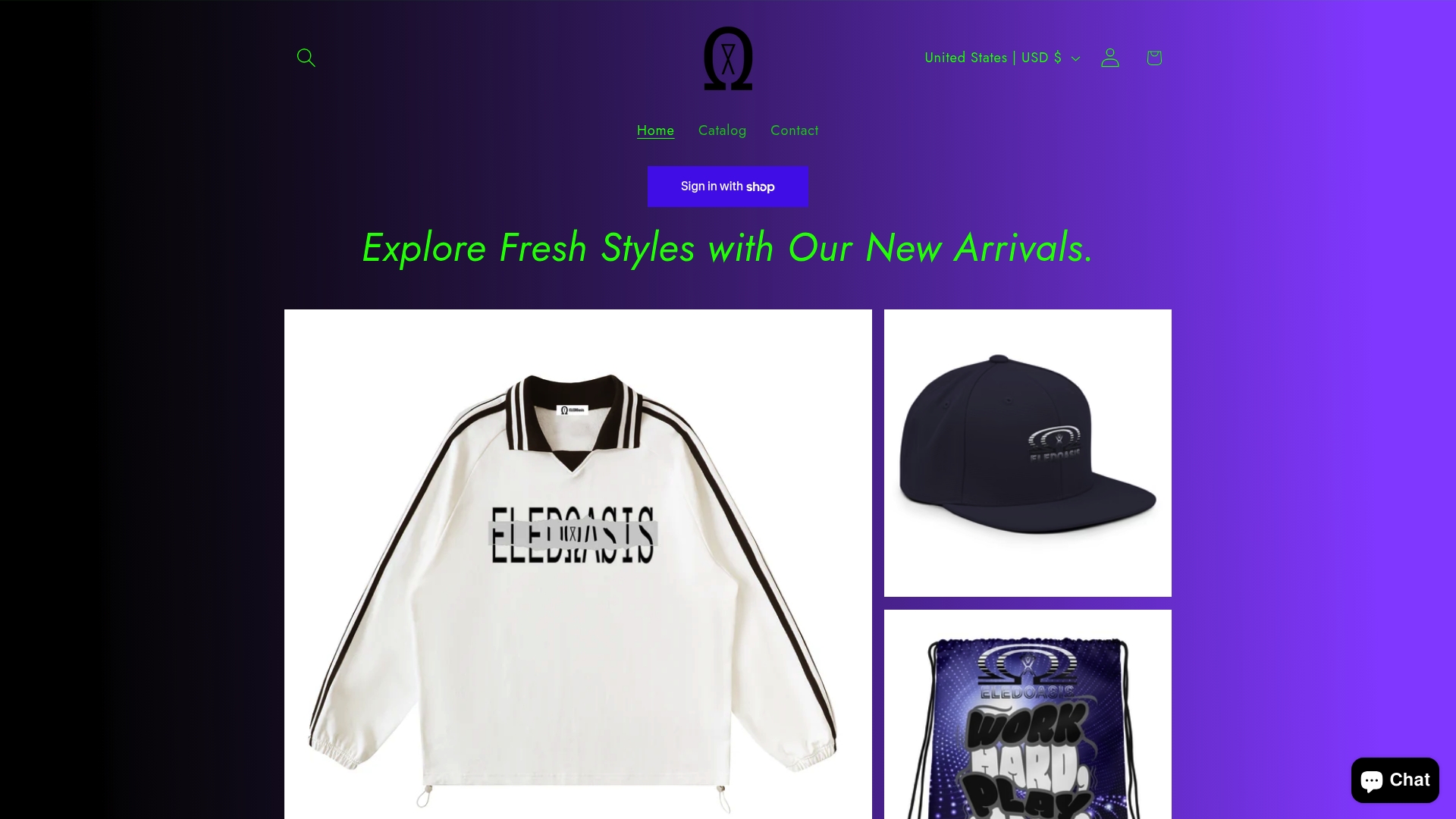
Our Unisex cotton sweats are the perfect neutral base for any color-forward fit. Pair them with a bold tee or layer up with a statement jacket. The cotton sweatpants give you that clean, structured silhouette that lets your color choices do the talking. And if you want a piece that carries intention in every thread, the consistency tee is built for exactly that. Come back to this guide while you shop and see how each piece fits your new color framework.
Frequently asked questions
What are the most flattering color combinations for streetwear?
Neutral bases with one bold accent color, like navy with orange or black with vivid green, work best for most streetwear looks. This approach lets your statement piece lead while keeping the overall fit clean and intentional.
How many colors should I wear in one outfit?
Aim for two to four colors per outfit to keep your look cohesive and visually appealing. More than four colors in a single fit creates visual noise that’s hard to pull off without serious styling experience.
How do I match colors if I don’t know my undertone?
Start by pairing your favorite color pieces with neutrals, then experiment with both warm and cool accents to see what makes your skin look its best. A personal palette via undertone analysis builds real confidence in your choices over time.
Can I mix patterns with bold colors?
Yes, but ground your look with neutrals and keep patterns or bolds to one focal piece for best results. Streetwear favors bold contrasts with minimal competing accents, so let one element lead and let everything else support it.
Recommended
- 7 Urban Fashion Styling Tips to Stand Out Boldly – ELEDOasis
- Creative fashion tips to elevate your streetwear style – ELEDOasis
- Master streetwear accessory styling workflow for 2026 – ELEDOasis
- How to mix patterns in streetwear: 2026 expert guide – ELEDOasis
- Different Colours and Their Symbolism in Chinese Culture